
It is so heartening to see that whoever can contribute to the crisis we are collectively facing are lending their support, be it their expertise or their sincere help. From artists auctioning their art works for charity or designers making PPE suits and masks to individuals feeding the hungry, or musicians performing for peace and unity, everyone is trying to do their part in making this pandemic less stressful. A Bangalore based graphic design studio, TSK Design, helmed by its founder Tania Khosla extended their support and in record time of only three hours, created branding for a non-for-profit initiative.
The Client
FeedMyBangalore is a not-for-profit initiative that is feeding migrant workers, daily-wage earners and vulnerable communities most adversely impacted by the Covid19 lockdown. It is driven by a group of entrepreneurs, corporates and start-ups and founded by Venkat KN, Chief Executive Officer, Prestige Group; Juggy Marwaha, Executive MD, JLL and K Ganesh, Serial Entrepreneur and Partner, GrowthStory.in. With an initial mission to serve 300,000 meals in Bangalore, the initiative has evolved into a citizens’ movement across India.
To achieve their goal, the group needed aggressive fund-raising, volunteers on the ground and support from local corporations like the Bruhat Bengaluru Mahanagara Palike (BBMP). All of this, in turn, demanded a brand identity to legitimise and mobilise the project at the earliest. In this case, the earliest meant just three hours!

The Brief
To create an identity that would capture the ‘spirit of giving’ and human connection in a time of this humanitarian crisis. An identity that gave the initiative the professional gravitas needed to reach out to funders who want to be ensured that their funds are being funneled ethically. The branding needed credibility and needed to be full and final in three hours.
The Steps
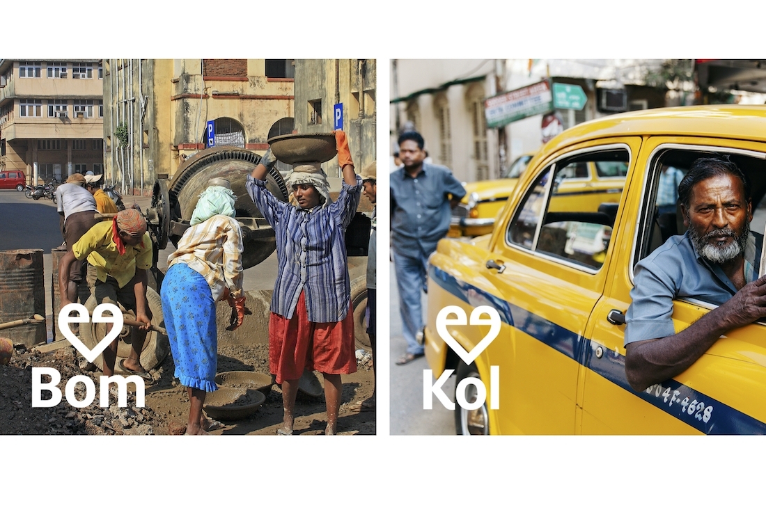
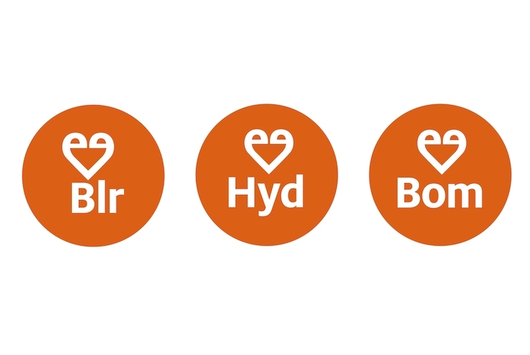
Without too much time for strategic thinking, we reacted from the gut. The identity needed to be optimistic, bold and easy to understand across language and socio-economic barriers. The logo is crafted from the 2 e’s in the word ‘Feed’. The symbol is a heart – a universally recognised motif signifying love and humanity. A subtle detail in the symbol is that the two curves or ‘eyes’ of the ‘e’ do not touch each other, while the two ends do. This is a call to the fact that, while we need to be socially distancing, we are all connected and in it together. In addition to the primary lock-up, designed for social media and quick recall, a circular symbol of the heart along with the acronym for each city, forms an easily identifiable icon.
The Colour
A bright, punchy, positive orange exudes a feeling of joy and optimism. The orange is bold and eye-catching and works extremely well in an urban context, to distinctly sign-post trucks that are set up across the city to distribute food.
The Result
The initiative that began in Bangalore has spread to Hyderabad, Mumbai and Noida. The identity extends seamlessly across cities as the initiative expands in scope. We hope and believe that the simple, catchy, ‘feel good’ branding has played a small part in mobilising funding and volunteers and resonated with the people who are serving and being served.
Platform Desk