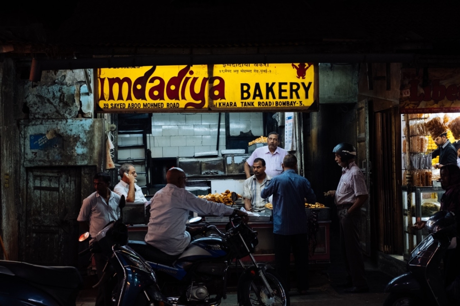

Bombay, with its inherent romanticism, has been the muse for many artists. It is a city that pulses with life, diversity, and rich culture. Photographer Aashim Tyagi captures this dynamic essence of Mumbai in the first issue of the Street Type Archive’s poster zine, Bombay Eats. The zine is an exploration of the city's eateries, with a particular focus on the interplay between food, typography, and urban culture. We sat down with Aashim to understand his inspiration and insights behind this fascinating project.
What made you cover the streets of Bombay and its typography?
The roots of the Street Type Archive go back 15 years. At that time, I was working as a graphic designer and had been living in Bombay for a few years. Initially, it was purely design research, examining the city's varied typography to learn from and inspire our designs, which paid close attention to typographic detail. However, Bombay is also a fascinating city to photograph, constantly changing and often overwhelmingly chaotic. I enjoy chaos and making sense of it, and Bombay was the perfect training ground for that. When my own practice shifted from design towards art and photography, the city's typography enabled me to explore its influence beyond just the technical and aesthetic values embedded in design research. I also began to pay attention to the cultural context in which these signs exist and how they are deeply woven into the identity of a place.
Can you share a bit about your personal connection to Bombay and how it influenced your work on this project?
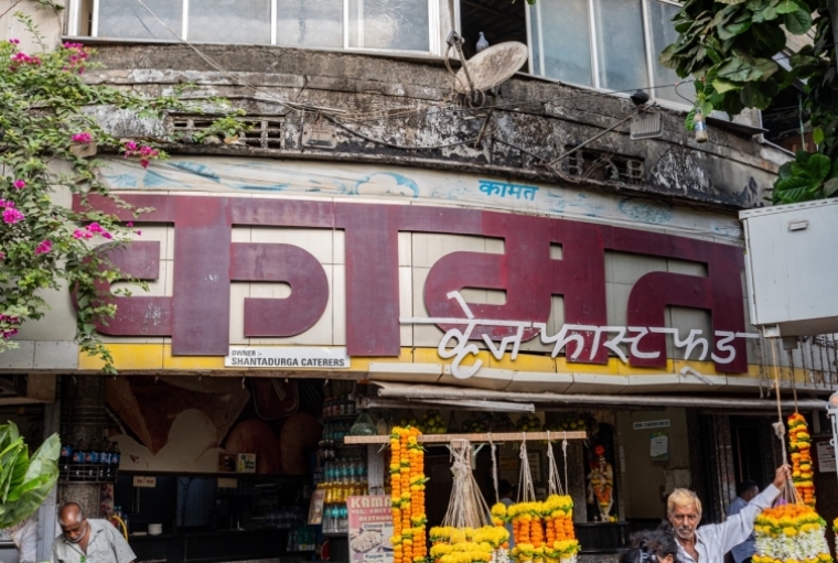
Like many, I moved to Bombay for work. It was home from 2006 to 2011, and even after moving to different places for life and work, I kept coming back and spent extended periods in the city since my family lives here. Documenting Bombay's typography taught me about its many coexisting cultures, the history, and the class systems that shape the city's visual language. These insights have been particularly useful when photographing new cities for this project, which feature unfamiliar languages and scripts. By interpreting cultural cues and understanding how typography fits into the city's broader context, I can develop an elective photographic approach.
How do you see the relationship between the typography of Bombay's eateries and the city's cultural and historical context?
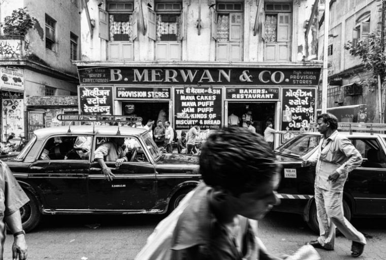
Typography is a conduit of communication, and through the photos shared in this zine, I hope to illustrate how this exchange of information occurs between the people and the city. In the case of eateries, the main objective is to capture customers' attention in a highly competitive market. In Bombay, I’ve observed this through the use of bold and creative design choices to attract new customers. Typography can also be customized to signal to their own communities, promising familiar and comforting food. While typography is just one part of the rich cultural and historical tapestry of a city, it is an important one.
What do you hope readers take away from Bombay Eats? How do you want them to see Bombay through your lens?
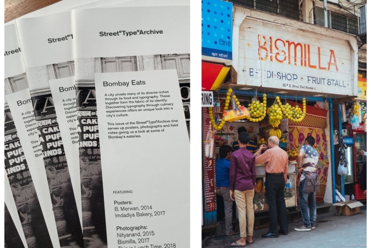
The core mission of Street Type Archive is to document the evolving typographic landscape of cities. With access to an archive of images spanning 15 years, I can share these stories in unique ways. The idea behind the zine series—starting with the first issue, Bombay Eats—is to invite the viewer into the world of typography through photographs and cultural contexts. Street typography is an integral part of our lived experience and an indicator of urban environmental change. Almost every sign featured in this zine has changed or disappeared since being photographed. While newer technologies and cheaper materials may be more economical, they often lead to the loss of craftsmanship and tactile beauty in older signs. In this way, Street Type Archive becomes a record of a passing era in Bombay and other places that have been photographed for this project.
Lastly, if you could describe Bombay in one photograph from your zine, which one would it be and why?
There are a couple of photographs in the zine that convey a more direct sense of “Bombayness” to the viewer, but my personal favourite is the signboard that simply states “This is Lunch Time” in Latin script, surrounded by food descriptors written in some of the regional languages and scripts one might hear on a regular day out in Bombay. For me, this sign captures the chaos of culture and the way Bombay manages to embrace it all and make sense of it. It best encapsulates my feelings towards this wondrous city.
Words Paridhi Badgotri
Date 10.07.2024