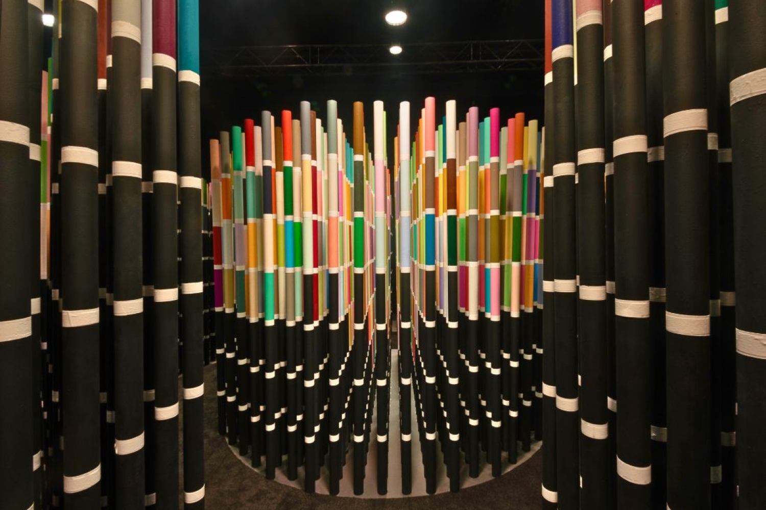

Suchi Reddy’s introduction to colours was through her mother, who would take her to weavers to make her own saris. It enlightened her about how colour is embedded in the Indian heritage and culture. After the New-York based architect and artist, became an immigrant, her understanding of colours evolved in terms of how it defined cultural boundaries and experience.
As someone who works with colours now all the time, she looks at colours with sense of having more than two dimensions. ‘Colour is always three dimensional if not more,’ she says. This mantra became the inspiration for the installation that was designed for Asian Paints' Chromacosm—featuring a maze of colourful pipes that take you on an immersive journey of experiencing colour as multi-dimensional. Reddy also sights her old inspirations that came into play—‘I have this book of early abstract drawings that are called Tantric Paintings with very simple geometric shapes but populated with colours and the way they understand colours and how they live next to each other, so it all started making sense into Chromacosm.’
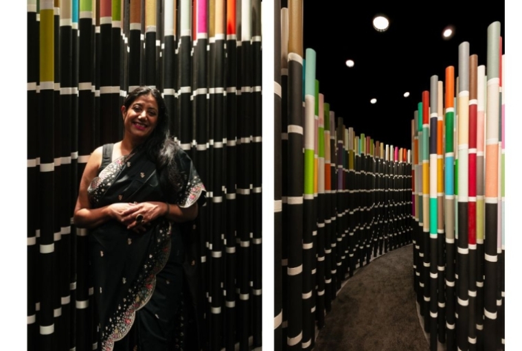
The installation was conceptualised to commemorate the launch of the world's largest architectural colour system by Asian Paints at the Snowball Studios, Mumbai. It will also be on display for public viewing at the Architecture and Design Film Festival at NCPA from January 9 to 12, 2025. The viewers are welcomed to immerse themselves in the forest of colourful pipes of over 2000 shades that showcases the potential of Chromacosm.
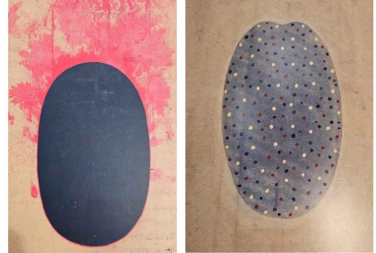
Tantric Paintings
The Germination of Chormacosm
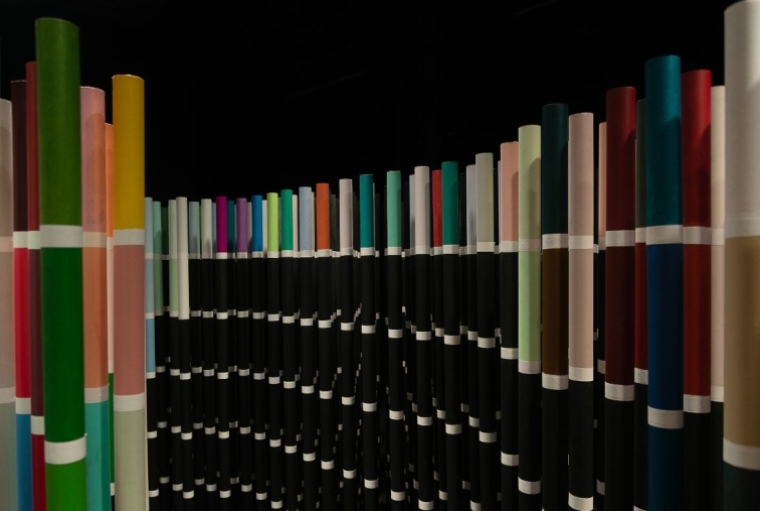
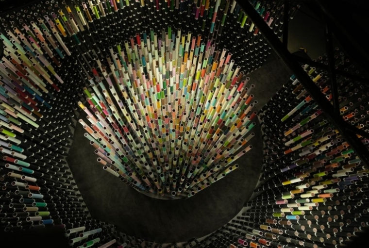
The installation features a circular bunch of black and white pipes tipped with multitudes of different colours within a rectangular bunch with only black pipes marked with white stripes visible from outside. Reddy tells us about the idea behind the design, ‘Chormacosm was about creating a cosmos. The idea is embedded in the title itself. How do you make people experience density, diversity, and multitudes? The installation had to reflect that. So I experimented with different materials—brick, wood, stone—trying to figure out what would be feasible and appropriate to lay color out.’
Neuroaesthetics into Play
Reddy has always been fascinated with the concept of neuroaesthetics, a discipline that focuses on how art alter our brain and behavior, which helps her to positively apply in the process of her creations. ‘Everything in the world attracts me to Neuroaesthetics! It’s a field I’ve been very interested in and working in for over a decade. Essentially, it’s about how our brains and bodies understand and experience the world. How could I not be interested?’ In Chromacosm, this practice finds a home in colours and patterns to understand the nature of space and it’s affect on our brains. ‘I have a very deep and nuanced relationship with colour, I have to say. I think about colour all the time, even when I’m just thinking of “white,” because white, in essence, is all colours combined. Colour is a very deep, neuroaesthetic trigger for people. It’s also a catalyst—it can amplify a feeling, dampen it, or allow you to feel the nuance of a feeling. I love how colour can modulate experience.’
The Use of Black and White
One of the major questions that comes to mind when one experiences the installation is why there is a major use of black and white in an installation that is all about variety of colours. Suchi explains ‘I was really interested in using black because black is the result when you mix all the paint colour together. That’s the colour you get. And when you mix colour in light, you actually get white. I’ve always been fascinated by this dichotomy. I wanted people to experience colour from within, which is how I experience it when I see it. So I created this kind of forest of black, through which colour emerges.’
The Joy of Discovering New Colours
Through Chromacosm, people can experience the feeling of discovering a new colour and that’s what attracted Reddy to this project. ‘First of all, I think Chormacosm will bring people great joy. Just flipping through the pages of the color library and seeing the range of colors flow like a wave is a beautiful thing. Designers and architects will love having this vast range to play with and explore. But I also think about the joy of discovering a new color. When was the last time you saw a new color? It’s like discovering a new world. For instance, there’s a color called Honey Yellow—it’s stunning. The joy of seeing a new color is like that—a delightful, fresh experience.’ Recognizing the industry's need for an expansive yet unified colour repository, Asian Paints created a streamlined system by using a combination of algorithmic and visual methods, with over 5300 shades arranged by hue and depth. This infinite-looking library is what formed the basis of Reddy’s latest installation.
Words Paridhi Badgotri
Date 19.12.2024