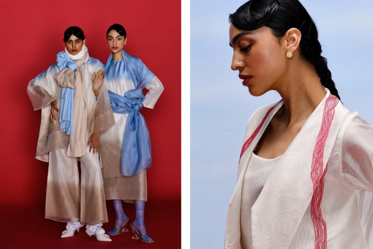

FEB o6 emerged from Rahat Kapoor’s deep-seated passion for art, transforming fabric into a canvas where creativity takes form. Since its inception in 2019, the brand has evolved significantly, influenced by the artisanal heritage of Amritsar and a commitment to originality and quality. We talk about the inspiration behind FEB o6’s latest collection, Symmetry in Distress, which draws from the dot paintings of Australian indigeneous artist Tammy Mathews. Rahat explains how the collection reflects the interplay of chaos and harmony seen in Mathews’ artwork, translating these concepts into luxurious silk garments adorned with intricate hand-embroidered lines.
What inspired you to create FEB o6, and how has the brand evolved since its inception in 2019?
FEB o6 originated out of my love for art and as a medium of expressing the same. To use fabric as a canvas and different mediums to give life to that canvas. The artisanal potential in the culturally rich city of Amritsar, the land of Phulkari, further convinced me to stick to silk threads as a major tool to draw my ideas on the textile. It also unknowingly changed the idea of how the city defined “fashion and fashion design” through the power of originality and innovation. Over the years I have learnt the value of quality garment making, how each ensemble should narrate the brand story and connect with every individual’s personality.
The new collection, Symmetry in Distress, draws inspiration from Tammy Mathews' artworks. Can you elaborate on how their dot paintings influenced the designs and concepts of this collection?
Tammy Mathews’ indigenous dot paintings are a beautiful representation of chaos and harmony coexisting. Her use of asymmetric lines, where no two lines are identical yet form cohesive patterns, resonated deeply with me. In Symmetry in Distress, we tried to translate that feeling onto fabric. Each garment in the collection mirrors the asymmetric yet harmonious nature of her artwork, with intricate hand-embroidered lines that create a visual rhythm, much like her paintings.
How do the hand-embroidered lines and luxurious silk threads contribute to the overall aesthetic and quality?
The hand-embroidered lines using luxurious silk threads are key to the collection’s aesthetic. Not only do they add texture and depth to each garment, but they also emphasize the idea of uniqueness and craftsmanship. Every line is meticulously embroidered, ensuring that no two garments are exactly alike, which aligns with the collection’s theme of finding beauty in asymmetry. This attention to detail elevates the quality of each piece, making it a treasured luxury.
The collection features a global color palette with pastel and warm tones, along with cerise and crimson red. What was the inspiration behind these color choices, and how do they complement the collection’s theme?
The pastel and warm tones in the collection are meant to evoke a sense of calm and balance, while the cerise and crimson red add a dynamic contrast. These colors were chosen to reflect both the chaos and harmony present in Mathews’ artworks. The soft tones bring a soothing backdrop, while the bolder hues draw attention, creating a balance that mirrors the collection’s theme of embracing both order and disorder.
As a fashion designer from Amritsar now based in Gurugram, how has your journey and the city's artisanal potential influenced your design philosophy and the development of FEB o6?
Growing up in Amritsar, I was always surrounded by the rich heritage of craftsmanship. The city’s artisanal culture has greatly influenced my design philosophy. I’ve always been passionate about combining traditional craftsmanship with modern aesthetics. Moving to Gurugram allowed me to expand the brand’s reach and further refine this vision. FEB o6 is all about creating timeless, understated designs that showcase the best of Indian craftsmanship while being globally relevant, and that’s something deeply rooted in my journey from Amritsar to where we are today.
Words Paridhi Badgotri
Date 21.08.2024