
At Platform, we love both the books and their covers. The design, the typography, the imagery, the various aspects of a book’s cover are often as crucial as the words written inside. Over the years, we’ve had a chance to speak to some of the most talented book cover designers in the country, so we are eager to shed a spotlight again on the story behind some of our favourite book covers.
The Blind Matriarch
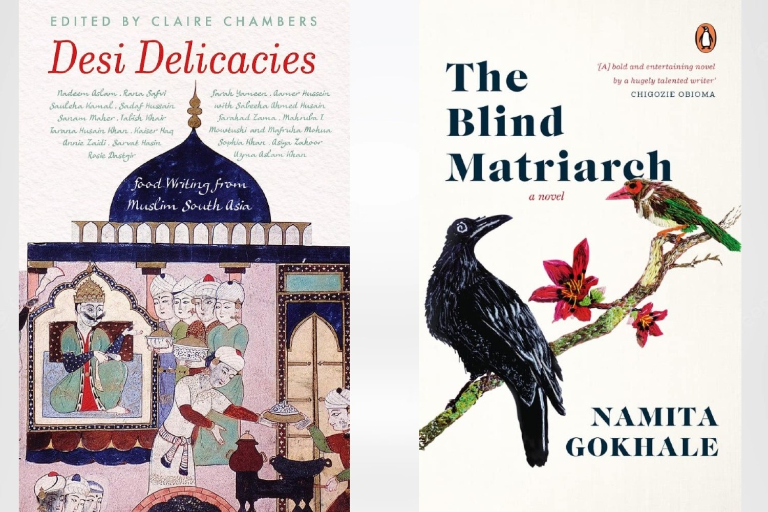
“There are two ideas central to the conception of The Blind Matriarch's cover — ways of being and ways of seeing. By being, I’m referring to attitude and belief, passion and intentions. By seeing, I mean the opportunities that one senses. This will help you see the world in new and different ways. I was thinking through making and handling stuff, I was thinking through materiality. Textiles have been such an integral part of the Indian cultural memory and have touched each life in some or the other way. Going back to this age-old technique in image creation wasn't just a tribute, but also an attempt to evoke the sentiments inspired by a protagonist that belongs to a bygone era. Furthermore, it was thrilling to adopt an approach that doesn’t complicate and conceal, and instead, engages and illuminates. One that is a balanced discourse between art and design, adding layers of meaning. If words can stimulate the mind, if they are fodder for the heart, can images possess the same magic quality? Can we make images linger? Can they have an afterlife?,” shares Gunjan Ahlawat on Namita Gokhale’s book cover.
Avasthe
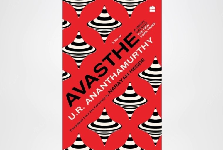
“In the case of Avasthe, a translation of the 1970s Kannada novel by U.R. Ananthamurthy that goes by the same name, the synopsis was very compelling, and although the editor Rahul Soni was clear that the last scene in the book (one with a spinning top) was a strong visual representation of the book, I didn’t grasp its true nature or intent until I read the manuscript. We had several conversations during the course of work to discuss other possibilities and landscapes that could make for a striking cover. The cover directions played largely with the dizzying theme of the book, and another that was completely different that depicted a dream sequence with parrots. Given the social and political subject, I felt that a Soviet propaganda-inspired typography and colour palette and a repeat op-art top, best reflected the ideology of the narrative, and the editor and the majority of the stakeholders felt strongly about this too,” shares Bonita Vaz-Shimray on designing the cover for the translation of U.R. Ananthamurthy's tour de force.

Desi Delicacies
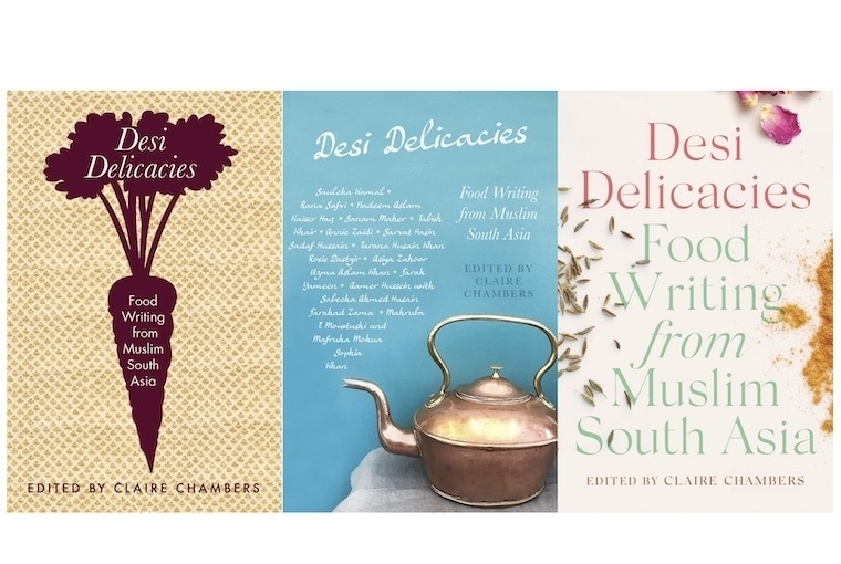
“I recently worked on the cover for Desi Delicacies by Claire Chambers for Picador India. The book is an anthology of food writing exploring Muslim history and culture across South Asia. It’s a collection of charming essays by well-known authors mainly from India, Pakistan and Bangladesh. The brief came with a few suggestions such as pictographic representation of a dish/ingredient or a typographic approach with an element from the book. The main idea was to not treat this book as a cookbook, even though each essay concludes with a recipe, but instead as a book of literary narrative food writing. As I read through the manuscript, I narrowed down the major themes of the book — food of course, history and a deep sense of nostalgia. I started looking for objects from kitchens across India and Pakistan — old utensils, crockery, patterns from old tablecloths, forgotten ingredients like black carrots that make a cameo in the book. These were some of my initial drafts:

The kettle was shortlisted, however, we decided to explore some more options for the book. While doing my research, I had come across beautifully illustrated pages from the Nimatnamah (‘Book of Delights’), which was commissioned in the 15th century by Sultan Ghiyath Shah, ruler of Malwa. The manuscript is written in Urdu and Farsi and is illustrated with 50 miniatures. Even though there is no mention of the Nimatnamah in the book, it ticked all the boxes. It was decided unanimously to go with the following illustration that depicts a feast in progress. Once the imagery was in place, I explored different type treatments to compliment the illustration, finally we decided to go with a classic title treatment. The editor was very keen to have all the contributor names listed on the front, so I decided to use a calligraphic script typeface to wrap their names around the illustration,” shares Bhavi Mehta.
Date 19-07-2023